
chasfh
-
Posts
23,034 -
Joined
-
Last visited
-
Days Won
172
Content Type
Profiles
Forums
Events
Blogs
Store
Articles
Everything posted by chasfh
-
Doesn’t that seem like just forever to play a game nowadays?
-
That might be enough to get Cora ****-canned.
-
Break up the White Sox! Three in a row!
-

Tigers Beat Writers Lionizing Sub-Replacement Level Ex-Tigers
chasfh replied to Edman85's topic in Detroit Tigers
He definitely has creepy hockey assistant coach vibe. -
If they Republicans lose Texas and Florida, they lose, period.
-
Who’s Waltz?
-
people are gonna die
-
Perhaps none on this list would have happened, except the first one at least.
-
Four solid reasons why it will never happen.
-
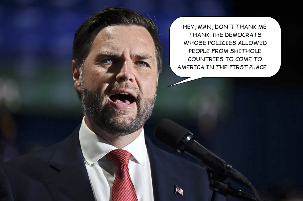
Or so I would imagine him saying ...

-
I didn't see anything like that in the CNN or Daily Beast stories I read about him earlier, but assuming it's true, either way, in that world, if you are not a full-throated supporter of Trump, you're a RINO at best, and more likely a Marxist commie Democrat.
-
Just in case anyone is still fantasizing that Roberts is one of the good ones …
-
Well, that sure didn’t take long.
-
I see they are releasing a lot more details about this guy than they did about the kid in the Pennsylvania attempt. Not for nothing, even though this guy appeared to support Trump the first time, social media posts indicate he quickly abandoned Trump, and now it’s easier to draw a straighter line to Democratic politics with this guy, which is what’s going to fuel a greater effort to implicate Kamala as behind an assassination attempt.
-
Yeah, that was a loose cannon decision Derek Bender will never recover from professionally.
-
They’re are definitely going to try to recondition Maeda as a starter next spring, but they have shown that they’ll run him out there as a bulk reliever all year if they have to.
-
Another way to cancel subscriptions like Apple TV+ is through iTunes. Yes, I still use iTunes. Don’t judge me. Also, yes, I still say “don’t judge me” …
-
Hey, someone else is on board with me about Spaghetti! 💀 Seriously, he’s not genuinely bad like Shep—hardly anyone can be—and I could sit through a game he's calling and be OK. But on occasion, his too-clever-by-half commentary can get on my nerves a bit. I will always prefer Dan Dickerson to Jason Benetti.
-
Fire Harris.
-
Well, technically …
-
So-called.
-
Several on my softball team. Actually Tiger fans, which is a bonus here in Big Shoulders. I might poll them on the question Monday if I remember.
-
I agree with your principle, although I don't think it's Players that drove that change. Baseball concluded that it just looked bad, and focus groups revealed a lot of fans agreed with them.
-
So Players is going to demand the opener be outlawed because guys like Rhys Hoskins and Adolis Garcia aren't getting enough homers? I don't see a path to it happening like that.
-
I've re-read it a few times, and I still think it's pretty clear the whole sentence is about Pete. I led with "smart-sounding take", which clearly references Pete, and then asked the question how Trump talking about this is supposed to achieve a net gain, which seems to me to be clearly about why does Pete think this, not why does Trump do this. After all, I didn't say "why does Trump think talking about". If I had, then I would be in total agreement with you. Instead, the entire sentence is about the smart-sounding take, not two completely different ideas separated by a sloppily-placed comma. The "but how does Trump talking about" part does the work of linking them together. Nevertheless, you're the person I'm supposed to have understand what I'm writing, so I'll consider striving to be less conversational in my writing and more exact in the service of hewing closer to crystal clarity.